top of page
MdGo
MdGo
DASHBOARD APP
Designing a Dashboard for a Tech-Based Emergency System Using a Car's Sensors to evaluate Injuries and Damage
YEAR
2019
ROLE
Research
UX/UI Design
3D Design
For confidentiality reasons, I have omitted or obfuscated restricted information. All information in this case study is my own and does not necessarily reflect the views of MdGo. While I can't share certain details of the research and deliverables, I can elaborate about my process and the general project scope.


01
vehicle to medical insights
Overview
MDGo is a technology company that provides a solution that intersects the automotive, insurance, and safety industries.
To showcase the technology to investors and potential clients, the company has developed a demo app that demonstrates how the app could meet the needs of users. The demo app provides a personalized experience of the product and allows users to see what the app might look like for their specific claim.
02
how to save lives?
Goals
MDGo's technology is designed for use by insurance companies and medical emergency teams as it analyzes the forces that were applied on the vehicle and on the different organs of the occupants.
The UI had to meet a number of requirements, including those of the company's CI, the feedback of insurance agents and emergency staff, and accessibility standards.
The UX patterns had to be consistent and applicable to various experiences and features throughout the platform.
Presenting data in a visual and meaningful way and turning raw information into actionable insights.
TRANSLATE
the data into technical knowledge and medical insights using AI and biomechanical tools.
RECONSTRUCT
the accident scenario, including accident mechanism, velocity velocity and angle of impact
MEASURE
the physical forces acting on occupants during a car crash, leveraging existing vehicle sensors
DELIVERS
seamlessly to first responders and trauma centers, as well as to insurance company.


One for All
CHALLENGE
The main feature of this project is data accessibility for users. The key challenge was to create an effective platform that would meet the requirements of emergency medical teams and insurance agents while producing a fluid and holistic user interface.
SOLUTION
Since this is the first encounter of stakeholders with the design of the app, I wanted to preserve the visual identity of the company and to design a product that would reflect its values. I used the brand's style guides as an anchor and expanded the design language to suit the needs of the project. Together with the owner, it was decided to design a bright dashboard that would suit the spirit of the medical field, combined with the brand colors. For maximizing the primary engagement area, I placed the the main bar on the left with collapse/expand modes.
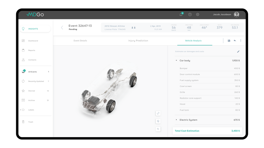
During the research, I examined the scenarios of use and the technology behind it. I divided the event data into three main classes: general data, potential injuries, and vehicle damages. These are supporting the different use cases: first-aid crew arriving at an event scene, hospital staff preparing to accept patients and insurance agents requiring information to inform damages. In each class, the relevant visual display is presented, followed by the data. To accommodate all the features I placed a tab bar to make app navigation easier.
03
one for all
04
knowledge/wisdom
Data to Knowledge
CHALLENGE
An essential part of the project focused on translating raw data into visual insights. The dashboard design needed to show complex data, graphs and analytics, thus it is important to keep the design simple. This makes the app intuitively interactive for informative analytics with minimal learning.
SOLUTION
I explored different graphs, charts and diagrams, and ultimately designed tile styles that shows low priority categorial information and archived events data, with graph analytics combined. In addition, each event is presented by 3D visualization and a map accompanied with interaction of drill down classifications of injuries and damages. The interactions include a hover state for a quick view to data layered and click state for quick access to details of the same.


05
design for people
The Human Factor
CHALLENGE
Although technology is embedded in every aspect of our lives, concerns arise with each new implementation of innovative ideas. This assumption has been confirmed through my conversations and research - especially when it relates to the health and safety fields.
SOLUTION
To overcome these concerns, the passive use of data viewing transitioned into an alternative experience, in which the user is an active participant in the process of extracting insights from the raw information.
I added push notifications, messaging and limited editing options in favor of expanding the scenarios and interactions between the various users and teams. By actively participating in the app, users will be invested in the process and develop a trusting relationship with the technology.
06
outcome
Dashboard Screens
07
conclusions
Final Thoughts
From the project’s inception, I was excited because it combined different design practices (UX/UI, branding and 3D design) along with advanced technology, that added real value to the benefit of our society.
As with any first version of a product, the design and planning process was accompanied by a clear responsibility’s to lay solid foundations for further research and its future development. Concurrently, there was flexibility to set the tone of the project and directly influence its advancement, particularly as the only designer on the team.
In summer 2019, during a Transportation Conference in Frankfurt, the company introduced its technological vision, and recorded a success in recruiting investors and attract customers.
It was a fantastic accomplishment to share with the company's team and to be able to demonstrate the technology while meeting the client's requirements. Moreover, I gained valuable experience from this project related to product and business processes.
bottom of page


